Visualizing Data in Grafana
Grafana is a powerful open-source platform for monitoring and observability. It excels at visualizing metrics, logs, and traces from various data sources, enabling you to gain deep insights into system performance and health.
Accessing Grafana GUI
Grafana can be reached on our platforms using port-forwarding using the following command:
kubectl port-forward -n monitoring services/vmks-grafana 3000:80
To externally expose Grafana to other machines on your network, add the --address 0.0.0.0 flag.
With the port-forward established:
- You can access Grafana locally on the control plane node at: http://localhost:3000/grafana
- If you externally exposed the service, you can access it from another machine on the same network at:
http://<control-plane-ip>:3000/grafana
You can then login into Grafana with the following credentials:
- User: admin
- Password: bubbleran
Predefined Dashboards
Our Grafana deployment includes several predefined dashboards that provide immediate insights into your cluster's performance and health. These dashboards are collections of panels displaying data from various sources. You can access them from the side menu by navigating to Home -> Dashboards.
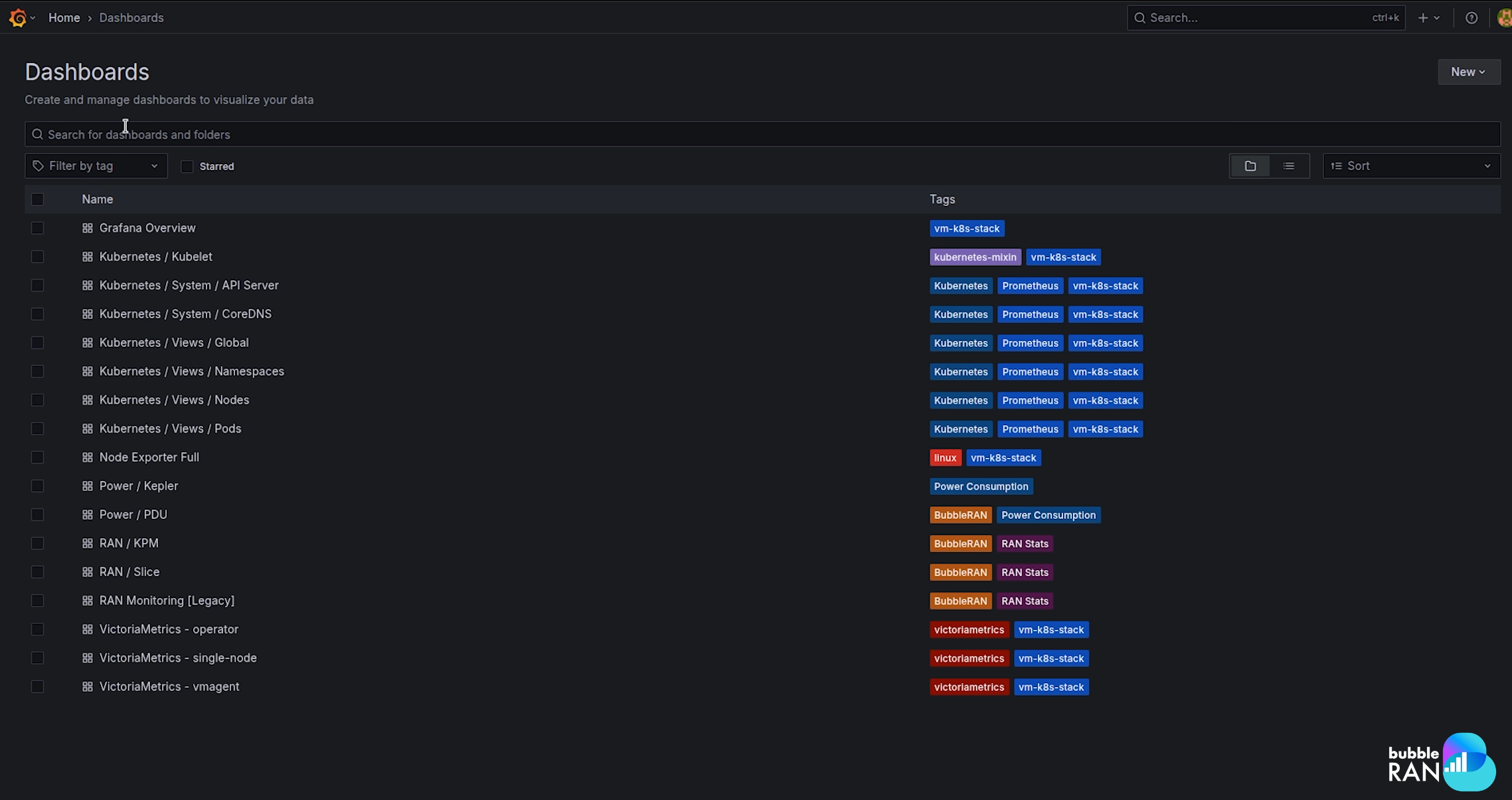
While you can use these dashboards as they are, you can also clone and adapt them to your specific needs or use them as a starting point for creating new ones. The available predefined dashboards are:
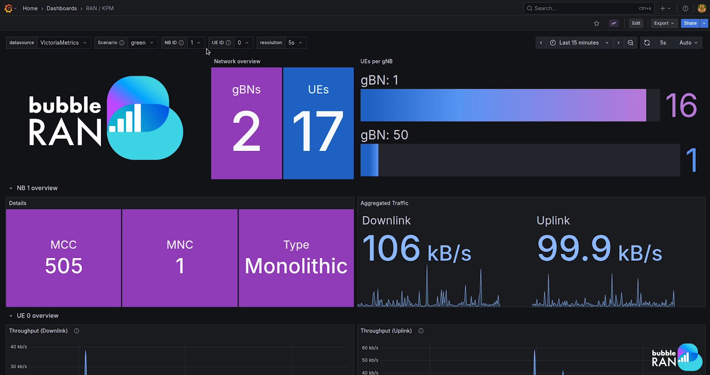
KPM dashboard
This dashboard presents a dynamic overview of key network parameters collected after deploying a monitoring xApp. It offers detailed insights into gNB performance and per-user equipment (UE) statistics. This includes uplink/downlink throughput and Physical Resource Block (PRB) utilization (used vs. available).
This dashboard uses the scenario annotation from the xApp. To show the correct data, please select the annotation in the dashboard that matches the one configured in the xApp.
Check xApps Generated Metrics to know more about it.
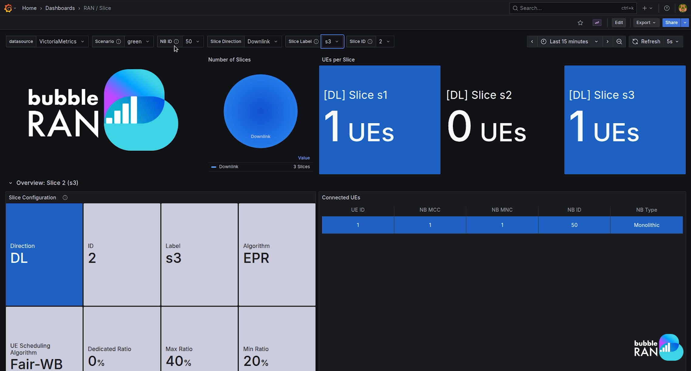
Slice dashboard
This scenario-oriented dashboard offers real-time insights into the performance and resource utilization of network slices, displaying key metrics such as slice configuration and UE connected per slice.
This dashboard uses the scenario annotation from the xApp. To show the correct data, please select the annotation in the dashboard that matches the one configured in the xApp.
Check xApps Generated Metrics to know more about it.
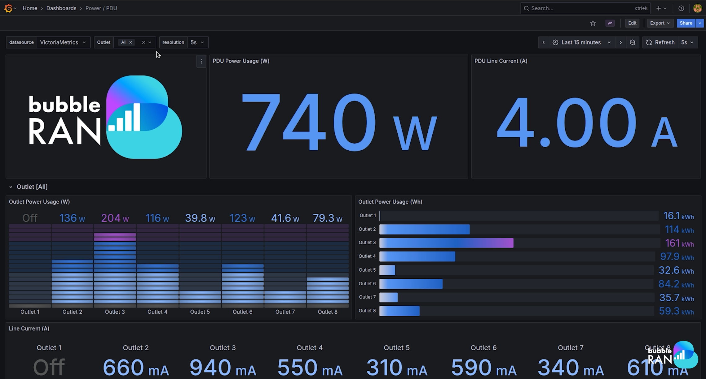
PDU dashboard
This dashboard visualizes real-time data from a Redfish-compatible Power Distribution Unit (PDU) integrated with the cluster. It delivers a comprehensive breakdown of power consumption across individual outlets, enabling precise monitoring and efficient energy management.
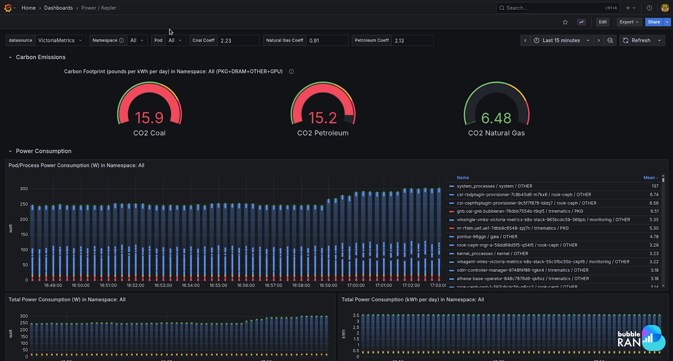
Kepler dashboard
Our deployment is equipped with Kepler (Kubernetes Efficient Power Level Exporter), which exploits eBPF to analyse energy-related system statistics. A dedicated dashboard offers insights into the cluster’s power consumption at a granular level (per pod and namespace). This facilitates energy-aware operations and optimization.
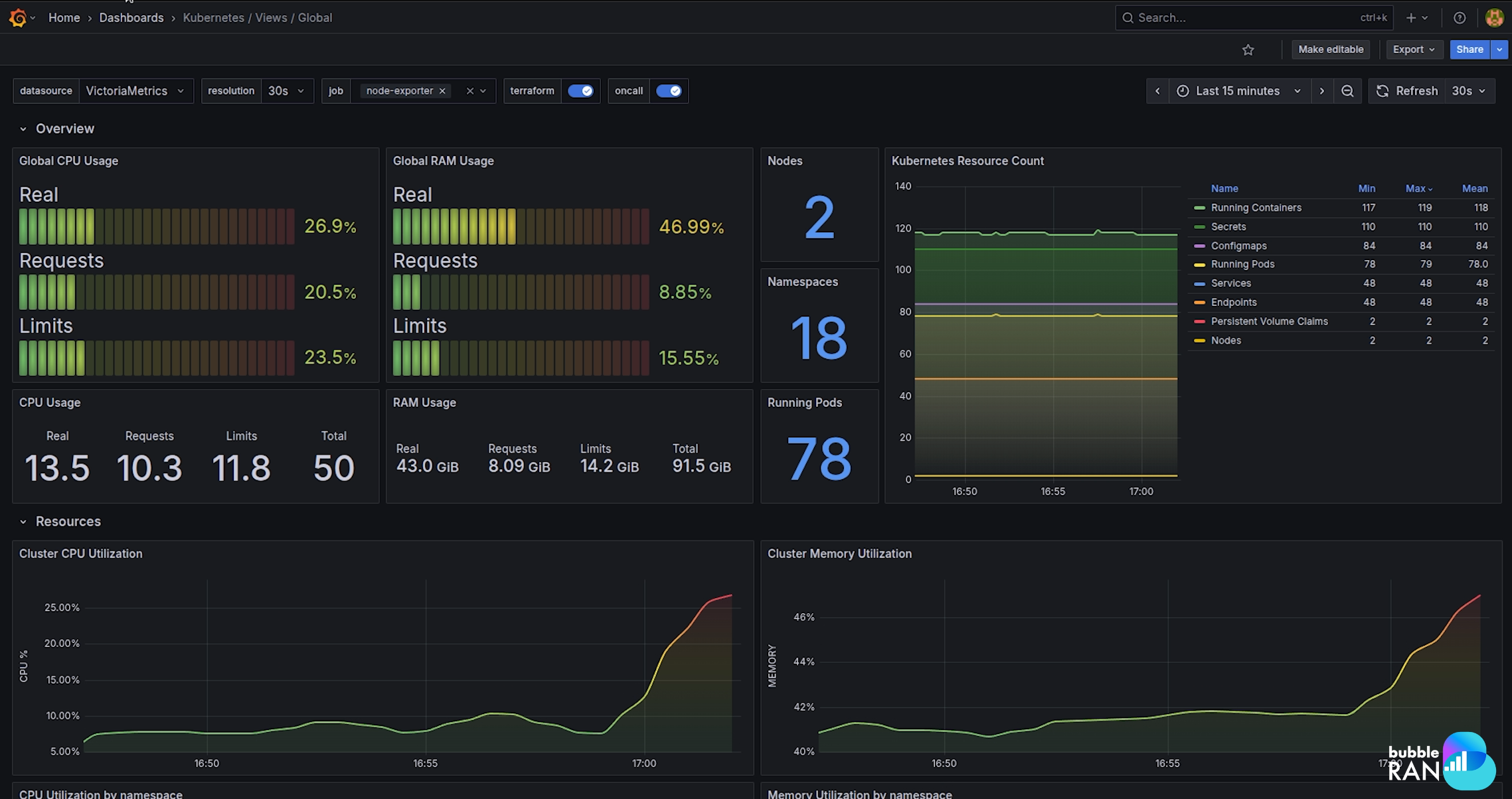
Infrastructure-related dashboards
This set of dashboards provides a high-level view of cluster health, node status, and resource utilization across your infrastructure.
Creating a new dashboard
To create a new dashboard, go to Home -> Dashboards -> New -> New dashboard.
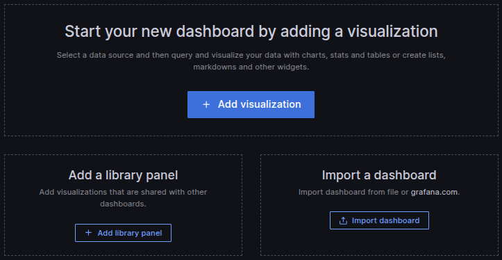
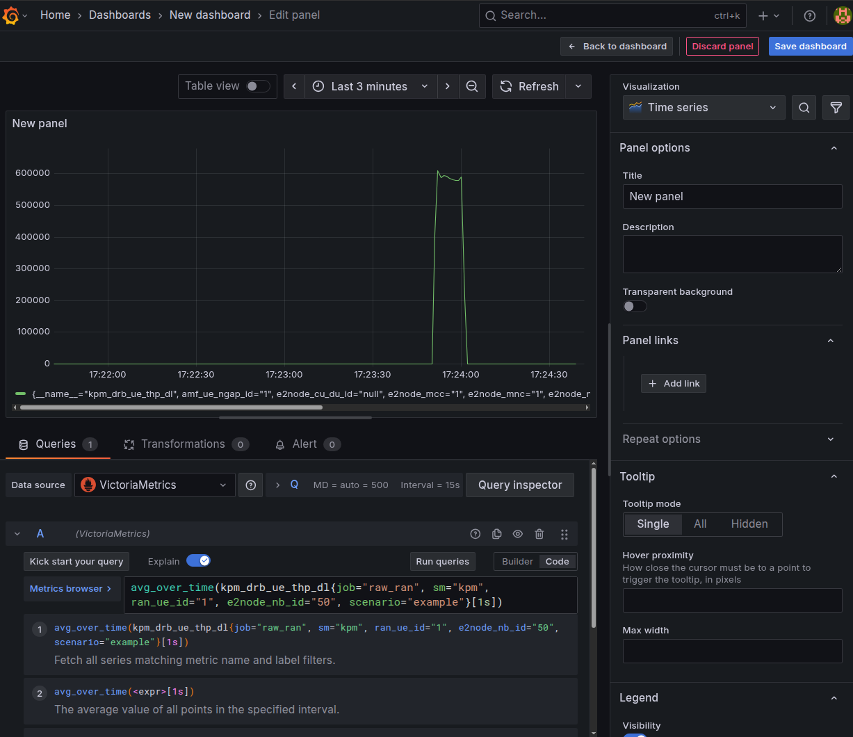
First, let's add a new panel. Click on Add Visualization and select Victoria Metrics as the data source.
Under the Query panel, queries can be built via MetricsQL language, both as a code or with a GUI builder. In our case, the first is used.
The available parameters and data sources are listed in the Data Sources and Available Metrics section.
Let's look at an example. In the following query, we will retrieve the 1s average download throughput for a UE for an example scenario.
avg_over_time(kpm_drb_ue_thp_dl{job="raw_ran", sm="kpm", ran_ue_id=<ran_ud_id>, e2node_nb_id=<e2node_nb_id>, scenario="example"}[1s])
Change the parameters of ran_ue_id and e2node_nb_id to match your network deployment.
Apply the query by clicking the Run Query and the panel should appear as in the figure.
It is possible to configure additional queries for the same panel, along with their visualisation details (e.g. panel title, axes). Once the process is completed, the Apply button in the top right corner of the panel has to be pressed to apply the changes.
Multiple panels can be arranged within the same dashboard. Any changes to panels or to the dashboard will be applied permanently by clicking the Save button.
Importing dashboards
Importing dashboards in Grafana allows users to quickly set up preconfigured visualizations without manually creating panels.
- Navigate to Dashboards in the main menu.
- Click New and select Import.
- Choose one of the following:
- Upload a JSON file containing the dashboard configuration.
- Paste a Grafana.com dashboard URL or ID.
- Directly paste JSON text into the provided field.